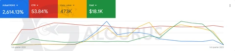
The hero above shows the idea in one move. Nine templates, three brand kits, two languages, and the grid stays coherent whichever way you switch it. That is what a design system does for social media: it separates the decisions you make once (colour, type, grid, tone, logo placement) from the work you do every week (the actual message). When those decisions are made properly, every new post is faster to produce, easier to approve and instantly recognisable.
Without a system, a feed drifts. A different designer, a rushed offer, an off-brand font from a phone app, and within three months the profile looks like nine different companies. People do not read your feed; they scan it. If the scan does not tell them who you are in under a second, they move on, and your ads pay for that confusion every time a click lands on a messy profile.
Our brand kit for social covers a primary and accent palette with tested contrast for text on colour, a type scale for headlines, body and labels in both scripts, logo lock-ups for small sizes, a photo and illustration direction, and a grid rule that says how posts sit next to each other. It is a short, practical document plus a set of master files, not a hundred-page book nobody opens. If you already have a full identity, we translate it into these social rules. If you do not, our Brand Identity Design team can build one first.
Then we design the work that runs on it. Most clients take a monthly plan: a set number of posts, carousels, stories and ad creatives, agreed with the content calendar from your social media manager or ours. Because the system is in place, our designers spend their time on ideas and copy hierarchy rather than reinventing the layout for each post.